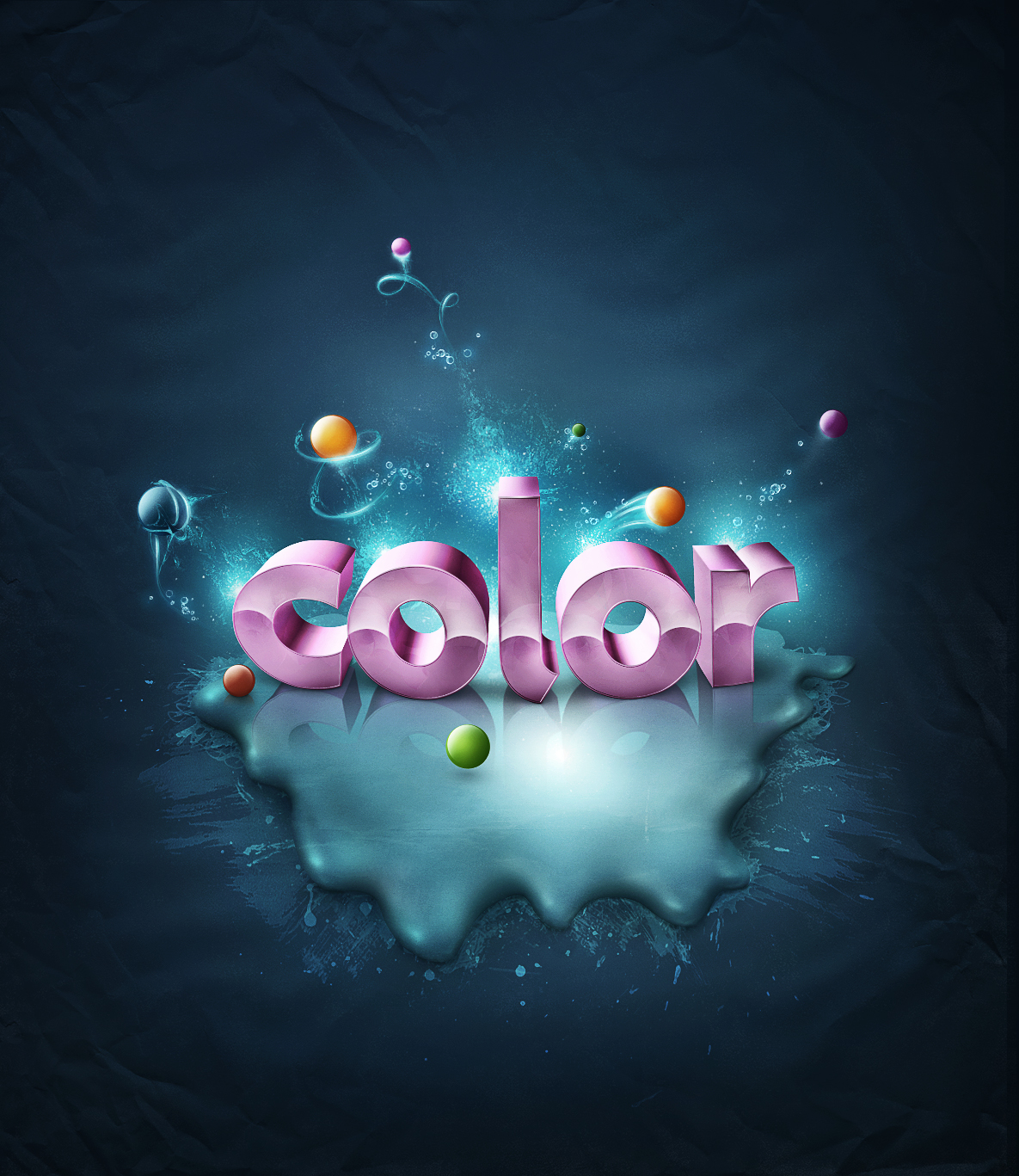
Final Image Preview
Let’s take a look at the image we’ll be creating in Part II of this series. Want access to the full PSD files and downloadable copies of every tutorial, including this one? Join Psd Plus for just $9/month. You can view the final image preview below or view a larger version here.

Introduction and Preparation
Welcome to Part II of this tutorial series. As I mentioned before it’s kind of a continuation of the tutorial Super Malleable Lines, there are some similar effects shown, but from a very different angle. In Part Two of this tutorial, we will focus on great glowing effects, some messy brushing and gloss effects.
We will begin with creating text reflection in our splatter, so you need to download the demo version of Xara3D 6. You may use Adobe Illustrator as well, but I strongly recommend to get Xara for this piece.
Images to use:
- abstract lights from 123rf.com
- bubbles from 123rf.com
- metal texture from cgtextures.com
- another metal texture from cgtextures.com
- papertexture from cgtextures.com
- ice crack from sxc.hu
- ink brushes from brusheezy.com
- watercolor brushes from brusheezy.com
Step 1 – Let’s Continue: Adding Text Reflection to Splatter
Just to remind you what we did in the previous image looks like when we ended, the first image below is the final one from Add Fantastic Color to 3D Text – Part I.
And as I said we will now move forward by creating text reflection. To do this you need to open Xara3D 6 and again create the same text with the Agenda font. Same size but a different view (second image below). Why are we doing this? Well, this is the time when you need to close your eyes and try to imagine how would the reflection look. Look again at the second image below. If you imagine this text flipped vertically, you will get a mirror reflection of our original text.
The colors of this text reflection aren’t that important as in Part I. This text will be barely visible so we will darken it anyway and erase half of it. But the main thing to remember, is that the text needs to be pink (as our original text).
If you already got this text generated, save it (Export) as shown in the third image below.


Step 2 – Creating Reflection: Adjusting
Bring the reflection text to our main project, name it “reflection” and put it somewhere below the main text (and below the shadow of this text) in the Layers Palette. Then hit Command + T (Free Transform) flip it vertically and then use Warp to adjust the reflection to the main text (second image below).
OK, now if your text is as bright as mine, grab the Burn Tool (O) set the Range to Midtones and darken it a little (third image below). It looks good but it’s still a little too colorful. I decided to decrease the saturation a little (Image > Adjustments > Hue/Saturation, and add a value of -22 to the Saturation).

Step 3 – Correcting Reflection and Adding Splatter Shine
This reflection still needs some touch-ups. So go to Layers Palette and select the “reflection” layer, then add a Layer Mask to it. Now grab the Gradient Tool (G), change its color to black and (while having the Layer Mask selected) drag a gradient from the bottom to the top of the reflection text (first image below).
Next Command-click on the “reflection” layer’s thumbnail to call the selection of this layer. Create a new layer above it, name it “reflection touch up” and change the layer’s Blending Mode to Multiply. Pick a dark pink color (#853b6d) from the colors palette, then grab the Brush Tool (B). Make the brush very soft and start painting inside the selection (second image below).
Now, make sure you still have your Brush Tool (B) selected, and also make sure it’s set to 0% Hardness and around 5-10% Flow. Pick a white color, go to the Layers Palette, move somewhere above our splatter layers and create a new layer there. Name it “splatter shine” and change it’s Blending Mode to Overlay. Now use a brush and start painting on splatter to create a nice shine (3rd, 4th, and 5th images below).

Step 4 – Adding Messy Splash Brushes
First important note before you start doing anything is to create a new layer group below the shadow splatter. Then open one of the downloaded brush packs and select a big messy brush (brush in first image below). Create a new layer, name it “Brush.” Use #cceeff color and set it throughout the whole splatter. Then go to Filter > Sharpen > Unsharp Mask, set the Amount to around 80-90% (first image below).
Once you do this, recall the selection of the splatter, and hit Delete on the keyboard while still having selected the “Brush” layer (second image below). Now press Command + D to deselect the selection, next turn the Opacity of the “Brush” layer to 30% and set its Blending Mode to Overlay (you should get something similar to the third image below).

Step 5 – More Splashy Brushing
Basically there are two ways of adding these brushes. The first one is shown in the previous step, and the second in the pictures below. You need to recall the selection of splatter, then go to Select > Inverse. Create a new layer, set its Blending Mode to Overlay. Grab the Brush Tool (B), pick a nice splash/splatter brush and add them on the left and right side beyond the splatter (like you see in the first image below). Play around with layer opacity, the higher opacity the harder the color.
Keep adding brushes the way you’re comfortable with. Work dynamically with the brush size and help yourself with Eraser Tool (E). Sometimes, you just need to get rid of unwanted splatter brush part.

Step 6 – Enhancing Splatter Shadow
Now let’s get back to the splatter shadow. As we made the shadow tiny before, now with the new surface we need to enhance it. Refer to adding shadow in tutorial Part I. So grab the Brush Tool (B). Set the color to dark blue (something like #125361), make your brush soft as before and add a little bit more shadow. Do it pretty much the same way as in tutorial Part I, just add a little bit more shadow and this time without having any selection.


Step 7 – Creating Brush Splatter
OK, now find some free space on your background. To do this pick only splatters that spread their parts widely. Create each brush on a new layer. I prepared a small guide below, what to do, and how to set these brushes and layers:
- #a5efff, Brush Opacity 60%, Flow 60%
- #a5efff, Brush Opacity 80%, Flow 90%
- #c4f2ff, same opacity/flow
- #e1f7ff, same opacity/flow
- #e1f7ff, same opacity/flow
- #e1f7ff, Layer Blending Mode: Overlay, Layer Opacity: 73%
- white color (here use a regular rounded, soft brush and enhance the center of this splatter)
- #d5f4ff, Layer Blending Mode: Overlay (here use a regular rounded, soft brush, in the center of splatter to create glow)
- #97f2ff, Layer Blending Mode: Overlay (here use a regular rounded, soft brush, around the splatter to create more glow)
When you’re done, go to Filter > Sharpen > Unsharp Mask, and set the Amount to around 60%. Apply this to each brush layer.
Note: If somewhere lacks information about Opacity or anything, it means it should be set by default to 100%.

Step 8 – Adding Lights
Select all the light layers and group them. Next, grab this group and drag it into the New Layer icon around 7-8 times to create many lights (fist image below). Place them where the natural light hits letters (but behind the text).
Now change your brush to a regular rounded shape (big diameter). Set the Hardness to 0%, Opacity to 100%, and Flow to 15%. Pick a dark blue color like #1c364d. In the Layers Palette create two new layers, one above the lights, and one below them.
Now refer to the third and forth images below, and start adding a darker color to the background between the lights. This will enhance the lights, making them more readable (you may even change the Blending Mode of this layer to Hard Light to make this effect even more visible).
Then copy the group with lights two times and add more lights. One to the shine inside the splatter and another one behind the text.

Step 9 – Texture effects
Open a cool ice crack image. Go to the Channels Palette and drag the Red Channel into the New Layer icon. You should get now something similar to the second image below. Now select the “Red copy” channel, select the black dropper (I believe it’s correctly called Black Point Dropper). Then click on a gray spot, and you should get something similar to the third image below.
When you’re done, Command-click on the “Red copy” channel’s thumbnail to load the selection of the white texture that remains. Now select the RGB channel and switch to the Layers Palette (fourth image below). Select the layer and use Command + C (copy). Then go to our main project document and hit Command + V (paste) – fifth image below.

Step 10 – Creating Texture
Now go to the Layers Palette into the texture blending layer options. Select Color Overlay and set the color to #94e3ed (first image below). Then create a new empty layer and merge the texture with this empty layer using Command + E (second image below). Now set this layer Blending Option to Overlay. Make several copies of this layer and use Command + T to rotate this layer.

Step 11 – Manipulating Textures
Now grab the Lasso Tool (L) and draw a path around any interesting you part (I selected here a really messy and detailed spot). Hit Command + I to inverse the selection and press Delete on your keyboard to remove unwanted parts (second image below).
Next select a spatter brush 39px, add a Layer Mask to this ice crack layer, select a black color and remove some texture (third image below).

Step 12 – Messy Texturing
Once you get this done, go to Filter > Sharpen > Unsharp Mask and increase the Radius a little. Repeat the whole process and create a few effects like this. The best solution is to put each one on light spots.

Step 13 – Color Spheres
Now, create a new layer group and make new a layer inside it. Name it “orange ball.” Pick #ffc000 for the color. Select the Ellipse Tool (U) (make sure you have the option Shape Layers selected) and create a circle. All needed settings you have are shown here in the second and third images below.
Next you need to create a new shape layer (on new layer) and set the color to white. Then create a new Layer Mask over there and paint with black on this mask to get rid of the middle and bottom parts (7th image below). Now this looks like a gloss or a light, so move this on our sphere and match it.

Step 14 – Creating Spheres, Continuation
For each sphere pick another color. Each process looks the same, only colors change. Work a lot with proper colors, they must fit your illustration. Try to find a good tone in between too bright or too dark.

Step 15 – Touching-Up Sphere Shadows
I don’t want to bore you showing the settings of each sphere that I created. I showed you how it works, so you should be able to pick some colors by yourself. Anyway create many spheres in different sizes and each one in a different color.
Now take a look at the first two spheres from the bottom – the green and red one. I like to see some realism in my work so I always try to put some stuff on the ground. I mean, we will just add some shadows to these front spheres (it’s not like you must do this, as this looks OK for now, but I think it gives a great overall touch).
So Command-click on the red sphere’s layer thumbnail to call the selection. Hit Command + Shift + C (Copy Merged) and paste (Command + V) this sphere. Now select this copy, drag it below the original red sphere, hit Command + T (Free Transform), and select Flip Vertical. Grab the Eraser Tool (E) with soft settings, then erase the bottom of this flipped sphere (third image below) to create the reflection.
Now refer to the fourth image below, select the Brush Tool (B), and pick #1a525f color. Make your brush very soft (by me soft always means like 0% Hardness and 10-20% Flow). Set your diameter to 2-3px and create a new layer below the original red sphere, but above the red sphere reflection. Then first paint exactly below the original sphere, along its bottom line to create a tiny hard shadow.

Step 16 – Flying Sphere Shadow
Now, let’s take care of the green sphere shadow. It looks to me like it was more in the air than on the ground so I decided to create an illusion with shadow that this sphere is really flying.
So take a look at first image below. I drew some arrows to show you how you should add this shadow. Because we are in 3D space, and there is some perspective, we need to make some depth with this shadow. As previously grab the Brush Tool (B) with the same settings, but change your diameter to a bigger one and create a soft shadow. Try to get a soft ellipse with a little harder center.

Step 17 – Malleable Lines
You probably should remember the Super Malleable Lines tutorial where I showed you a great technique of simulating shape layers. Well it’s the same thing now. If you like you can refer to the Malleable Lines tutorial as well. But in this one, I made it more custom.
Grab the Line Tool (U), drag three lines in one column (first image below). Then apply some layer styles (second image below) to give this piece a color variety. Then use Command + T and select Warp. Bend this shape layer as many times as you need, and try to achieve a nice, thin, curvy lines.

Step 18 – Selecting Proper Parts
These shape layers are never perfectly shaped after bending. So in the first picture below I selected the parts that we’re interested in. In the second image below I selected the parts that you need to get rid of. And in the last picture below they are simply erased using Layer Masks with a hard black brush.
Note: It’s a great thing that you actually can use layer masks on shape layers, you simply loose nothing, you can recreate the layer when you want.

Step 19 – Constructing Lines
Something like this is very hard to achieve using only the Pen Tool with path stroke, so I construct lines with small pieces (and it’s great because they are still shape layers).
As you have prepared a few shape layers (curvy lines), use them, copy them and rotate them to create one curly line going around the orange sphere. You just need to set lines properly and they will do everything for you.
Note: Remember to blend the connections between lines nicely. Use layer mask to do the blending part.
Once you achieve a cool curly line, select all these shape layers and merge them into one (Command + E) (but always save some extra copies of your shape layers that you don’t need to recreate them). Next, you probably should get something similar to the third image below, and you need to decide which line to erase from the sphere because now it’s not looking right.
Refer to the forth image below. Add a Layer Mask to our merged layer, call the selection of orange sphere, grab the Brush Tool (B), pick a black color and erase one of these two lines that cover the sphere.

Step 20 – Enhancing Malleable Lines
Before we do anything further, you need to change your brush settings. Go to the Brush Palette and apply the settings shown below. Change the brush Opacity to around 15% and the Flow to something like 50%. Pick a bright blue color (like #baf3ff).
Create a new layer, change its Blending Mode to Overlay and start painting on the malleable line. This will make the line thicker, and this brush the way we made should easily allow you to paint with the mouse. You need to set many small marks to get this line more visible, and this covers some imperfections.

Step 21 – Creating Glow
Now this is my favorite part. I believe the photo of abstract lights was taken on slow shutter, looks like a painted glowing light, and it’s great. Open it in Photoshop, pick the Lasso Tool (L) and select a piece of this glow. Drag this to our main project.
Use Command + Shift + U to desaturate this it. Then grab the Eraser Tool (E), make the settings very soft and erase the hard edges of this piece. Then hit Command + T (Free Transform) to match it to our malleable line. Select Warp (Command +T to get the option bar) and adjust it to the line shape. Help yourself with a soft eraser if something doesn’t fit.

Step 22 – Creating Glow, Continued
Select a very light blue color (like #8cfbff). Reset your brush settings, and set the Hardness to 0% and Flow to 5%. Then create new layers above the previous ones (and above the malleable line). Set this layer’s Blending Mode to Hard Light and add some more glow to shining parts of the sphere and the line. Don’t overdo this, we’re looking only for a touch of glow.

Step 23 – Malleable Line, and Glow Process Repeat
As the title says, yes this will go the same way again and again. Apply these effects to each sphere that you have created. And remember that everything needs to be set up as in this tutorial. You simply cannot create these glowing effects in blue color if your illustration has pink or orange background, this also needs to be blue. And most important information: glow effects work the best when they are applied to the dark background. Below is a small case study for blue sphere treatment.

Step 24 – Adding Bubbles
OK, after applying more of these glow effects you will reach something similar to the first image below. Now, let’s take care of some more details. I found a nice picture of bubbles and thought it may be used well. The only rule is that this picture needs to have a black background.
So drag this image to our main project document. Press Command + Shift + U (Desaturate) – second image below. Change its Blending Mode to Screen (third image below). Now use Command + T to rotate it in different ways to create a messy look. Help yourself with a hard eraser if some bubbles are disturbing.
Finally create a new layer above all the bubbles, set its Blending Mode to Overlay and select the Brush Tool (B). Use very soft settings, pick #8cfbff color and slightly paint on these bubbles. This will give a nice glowing touch.

Step 25 – Background Textures
Now open some dirty image (I picked the one below, as it has mass details). Hit Command + Shift + U to Desaturate (second image below). Next hit Command + L (Levels) and adjust it to get a visible difference between black and whites. Next go to Filter > Sharpen > Unsharp Mask and sharpen this texture a little.

Step 26 – Applying Textures
When the texture is ready, drag it to our main project document. Set its layer Blending Mode to Screen. Grab the Eraser Tool (E), set it to Hardness 0%, Flow 10% and blend the texture with the background. Repeat this process to fill some empty space in the background.
This may be hard to see, but the texture is there. This gives a little noise to the background and makes it irregular. I like it this way.

Step 27 – Paper Texture Effect
Open the paper texture image. Unlock this layer by left-clicking two times on it. Then use Command + J (duplicate). Once you get the duplicate, set its Blending mode to Overlay and go to Filter > Other > Highpass, and set the Radius to around 40% to get some depth in the darker spots. Then drag both these layers to our main project. Grab the Eraser Tool (E), set it to Hardness 0%, Flow 10% and blend both textures with the background. Use this technique to sightly fill the whole canvas.

Step 28 – Final Adjustments
The final adjustments are very important as they give a unique look to your work. Go to the top of the Layers Palette and add several adjustment layers as you see in below. Add them one by one and work with their opacities and on the layer masks.
Example: When I added Levels (first image below) the shadow below letters seemed too dark, but the adjustment layer fit the whole illustration well. So I selected the Layer Mask of the Levels layer and erased the black shadow from below the letters using a soft, black brush. And so on with more adjustment layers, if something doesn’t look right at some spots, help yourself using layer mask and a black brush.
The gradient maps in the third and fourth images below are from Black color to Gray and from Black to White (I guess there was no need to write this down, but if you need to know here it is).

Conclusion
In the end you can sharpen this image a little using highpass or unsharp mask. This will give it some more quality. But anyway, it’s the end, I’m glad you could reach it to this point, as this was a tough piece. Have fun with your own works. May the color be with you!
You can view the final image below or view a larger version here.
Subscribe to the Psdtuts+ RSS Feed for the best Photoshop tuts and articles on the web.
4 comments
프로그램이먼가요?
안녕하세요 ^^
3D글자는 뭘로 한건지 모르겠구요.. 그 외에 나머지는 포토샵에서 리터칭한것입니다.^^
xara_3d_v.6.0
3d글자는 위에 적혀있는 프로그램으로 만든거예요
초창기의 xara는 써보긴했는데, 저렇게 변모를 했군요..ㅎㅎ
나그네님께서 친절히 답변을 해주셔서 감사합니다.ㅎ
Comments are closed.